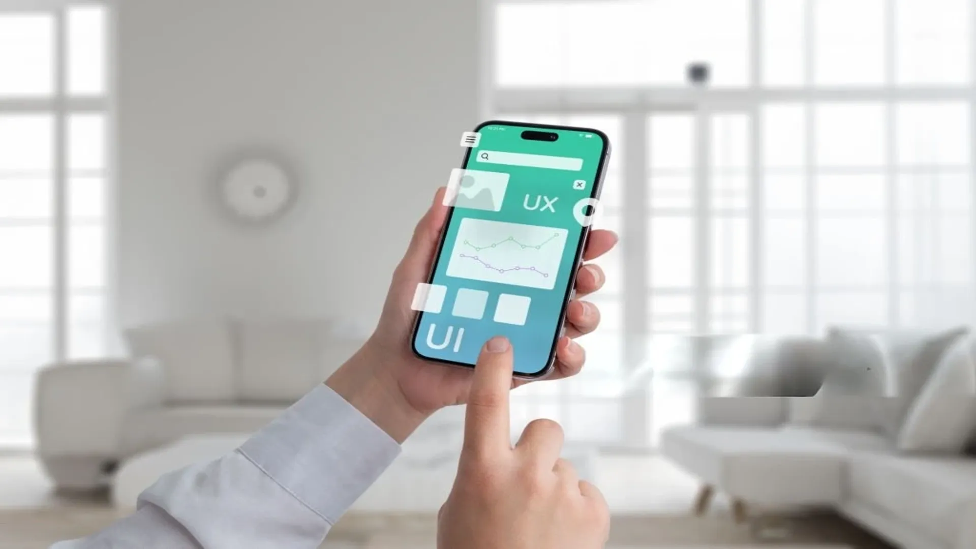
Do you think people today download apps just for the technology behind them? Actually, they download them because they feel right to use.
That smooth swipe, that intuitive flow, that one-screen checkout that just… works — that’s not luck. That’s good UI/UX design doing its job quietly in the background. And in today’s crowded app world, it’s often the difference between an app that gets deleted in two minutes and one that becomes part of someone’s daily life.
Whether you’re building a mental health platform, an eCommerce app, or a productivity tool, one truth cuts across all categories: you can’t design for screens without designing for people. This blog breaks down the essential UI/UX principles that truly move the needle — the kind of choices that shape how users feel, act, and stay.
1. Design for Thumb-First Navigation, Not Desktop Logic
Users don’t click with a mouse anymore. They’re swiping, tapping, stretching their thumbs across ever-larger phone screens, often with one hand while holding coffee in the other.
This is where many apps trip up: they bring a desktop mindset to mobile UX. But smart mobile UI puts primary actions within natural thumb zones, limits cognitive load, and embraces gestures as part of the navigation experience. Floating buttons, bottom nav bars, and contextual actions aren’t just trends. They’re usability essentials. If it’s hard to reach or confusing to find, it’s already too late.
2. Clarity Over Cleverness: Make Every Screen Obvious
Every screen in your app should answer one silent question: What am I supposed to do here? Whether it’s signing up, scheduling, or scrolling, users should never have to guess. That means clear hierarchy, simple CTAs, and visual cues that guide the eye.
A common UI mistake is over-designing — adding layers of animations, colors, or icons that look cool but make things harder to understand. If your app looks like a design showcase but feels like a puzzle, it’s a fail. Because the truth is, clarity builds confidence, and confidence drives action.
3. Prioritize Microinteractions — They’re Where Emotion Lives
Animations, sounds, haptics — the small details that many teams ignore are often what make an app feel alive. That little bounce when you add something to the cart. The vibration occurs when a task is marked done. The way the screen transitions smoothly instead of snapping between views.
These are microinteractions, and while subtle, they’re where your app expresses its personality and earns emotional points. They also help with feedback and status, confirming that a button was tapped, a form submitted, or a process completed. Future-forward apps are investing heavily in delightful micro UX, and it’s one of the key future app design trends to watch in the years ahead.
4. Build Accessibility into the Foundation
If your app isn’t accessible, it’s broken, even if it works perfectly for you. Today, designing for accessibility is smart product thinking. That means using sufficient color contrast, scalable text, voice-over compatibility, and avoiding tiny touch targets. You should remember that inclusive design leads to better design.
5. Personalization Should Feel Thoughtful
The line between helpful and invasive is thin, but top-tier apps walk it carefully by using behavioral personalization in ways that feel respectful, not robotic. It means recommending relevant content, remembering preferences, and adapting to usage patterns.. A good UI/UX design learns quietly, adapts softly, and supports proactively. When done well, personalization feels like convenience. When done poorly, it feels like surveillance. So, try to keep it human and contextual. That’s what makes users stay.
6. Speed Is First Impression
Speed is part of UX. From load times to tap response, your app needs to move at the speed of thought, especially on older devices and slower networks. You should try to optimize imagery, minimize unnecessary animations, lazy loading content, and prioritize perceived performance (like loading skeletons or progress indicators).
7. Design for Empty States
Most designers obsess over the happy path — when everything’s working and the user knows what to do. But what about when a page has no content, or a form is incomplete, or a network fails mid-action?
Instead of showing error codes or blank screens, your UI/UX design should offer friendly messages, contextual help, or suggestions for what to do next. Empty states are opportunities to guide and engage, not dead ends. This is where UX maturity really shows when your app behaves thoughtfully, even when things go wrong.
8. Test With Real Users
Design is never done. No matter how smart your flows or clean your UI, real feedback is the only truth. What makes perfect sense to you might confuse 8 out of 10 users. That’s why user testing is highly needed. Watch users use your app. Observe where they pause, where they rage-tap, where they bounce. And then iterate to evolve it. The best UX is always in beta.
Conclusion: Design That Cares for Users Always Wins
UI/UX design isn’t about attractive visuals or the latest flashy interaction trend. It’s about valuing your users’ time, their attention, their needs, and their experience. It should simply let the user do what they came for. And that kind of design requires expertise and experience.
So, whether you’re a founder, a designer, or a product manager, here’s the real takeaway:
Design less for screens, more for situations. Less for aesthetics, more for clarity. Because when design feels invisible, intuitive, and personal, that’s when your app starts to have a real impact on users.